Project One
When beginning this project, I was very intimidated, since even though I have experience coding I have never worked in HTML, or anything else to do with web development. It turns out that those concerns were properly held since I had several problems that I needed to overcome to finish this assignment. In retrospect the majority of my problems came through me making mistakes that costed me time, and patience. While the assignment it's self was not bad at all.
The Start
To start, I followed Madison Dunaway's instructions. They were very helpful at first. They got me to the point of creating an account on Github, and creating a repository. However at this point I ran into my first problem that being the fact that I have a windows computer which doesnt have the versitility within it's command prompt that a Mac has. To resolve this I had to download git.
.png)
After downloading git I was able to use that in a very similar manner to the way that Madison used the command prompt on the Mac. Now with the command prompt problem solved I just needed to save the reposiory to a documents folder for this class.
.png)
The Website Design
With the repository intilized I was in the perfect position to simply find a preset edit a couple of things, push it or be done. However that is not at all how it ended up going. To start with when using brakets, a text editing software reccommened to the class because of how friendly it is to web design, I couldn't access parts of the functionality. Most importantly to me initially was the fact that the live previes feature for whatever reason was not showing any results for the code that I put in. The code that I was putting in came from w3schools.com.
.png)
At that point, I was worried, but figured that I could just push the template to the website, and then just do the work very slowly from there. That is when I noticed the much larger problem that I did not have a push command available to me at all on Brackets. I won't keep you in suspence, what ended up being my problem was that I had opened the file, and not the folder where the repository was. So what I think I was trying to do was just push and .html out into the ether. Once I finished that I got to work on making the template my own.
.png)
The First thing that I wanted to change was the color them of the website. The template that I picked out had a very nice navigation bar and side bar to work with, but I wasn't a fan of the blue color. The website also originally was purposed to be the website for someone who is running a buissness so some of the tabs needed to be either removed or repurposed to things that I find funny. The thing that probably caused me the most problems when trying to figure out the layout was the footer.
The Footer
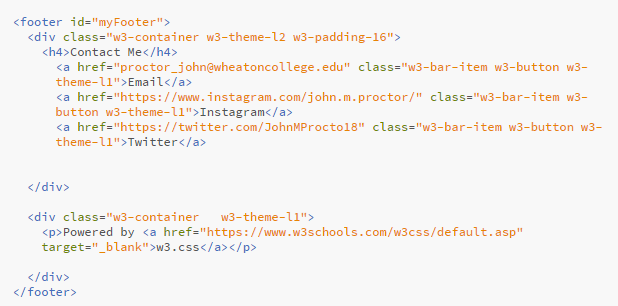
What cause me so many issues was my own hubris and misunderstanding of how formating works. This code that your looking at now is nearly the final form, however it has gone through several iterations. Originaly the template didn't have a contact me portion in the bottom, which was not something I could abide. So I got to work adding the button links to various ways to get ahold of me. That went smoothly, except that it made the footer a little larger. Not too cataclysmic. The choice that caused me problems was my bright idea to have the footer always at the bottom of the page. Really at the time I didn't realize that was my intention, but I noticed on pages where I didn't have enough text sometimes my footer would be below the text but with white space below it. That bothered me. I felt the best way to go about fixing this was to add the bottom command to the div for the contant information and the powered by w3schools info.
This caused it's own aesthetic issues. What would happen is the bottom most footer would intersect straight over the contact information. In my infinite wisdom, I thought "Easy fix, just increase the padding for Contact Me, and it'll be far enough away!" How young and foolish I was then. In order to get the contact information not be covered the padding for the window had to be increased up to 64 from 16. Now more then any other point in this write up I wish I had taken a screenshot at the time because it looked awful. The footer would take up roughly the bottom third of the screen at any given time and would completely block out most of the paragraphs toward the bottom of the page. The worst part about it.
I kept it like that.
Not for long, but there was a point in time where I looked at it and I thought well... if you scroll down and I have a bunch of blank space at the bottom it'll be fine. My grand plan to stop you the user from seeing white space was to instead flood the bottom of your screen with a tangerine footer.
That showed me at that moment that I needed to step away for a bit because I was starting to compromise on the overall useability and functionality, for literaly no positive benefit. I think at that time I had just lost my mind a little.
Luckily I came back to the project before it was due and reconsidered a design choice, and in the end I have the footer laid out as they are now. Perhaps on some pages it may not look the best, for now. However it us laid out so that when I expand pages it'll be able to accomadate that, and won't take away from the user experience.
Addendum on Footers
Now looking at this code, if you've worked in html before, you might notice an issue. For any of you who haven't I'll point it out. The link for my email in the footer, doesn't work. As of now I'm still not entirely sure how to fix it, so there it stays as a placeholder. (please don't be upset Madison I would remove it but I plan on making it work at one point and if it isn't there I'll forget).
Conclusion
When starting this project I very concerned about wether or not I'd be able to finish this assignment, and if so what I'd be turning in would be something that I'm proud of. I'm happy to say that I think that this website is off to a really solid start. After the rocky start I had, I really started to enjoy working on the sight, and trying to get things to look how I want them to, and to have things laid out in a way that I enjoy. More then just my own personal enjoyment I also feel like a learned alot. I learned about file management. I learned about html, and most importantly I learned that Squarespace should be out business.